Page 3 of 14
Posted: Sat Mar 13, 2004 1:18 pm
by LazyOldman
WOW! Paul Stevens you are my GOD!!!!! I really can't wait to get stuck into the finished product!!!!!
Ran it from windows\start menu\programs\ showed he dunegon master logo, then the CSBwin options screen, i selected Dungeon and got the following debugging pop ups;
Debug graphics - R10ae 0
Debug graphics - Palette 0
Then it goes to the front door, i click Enter and the door opens with sound - Yeah baby!!! and get the following debugging pop ups;
Debug graphics - R1f746 0
Debug graphics - CREG 0
Debug graphics - ReagGame 0
Debug graphics - exception 0
Then the game closes.


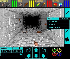
The graphics don't quite fit the screen, i guess you've got to adjust them... is it possible to rotate them? so the game plays in landscape? It's just a question of whether that would require a complete rewrite, or if it's a relatively easy option within the os code... something like this?

Sorry about the low quality images... had to use my web cam to get them...
But just as a teaser for all of you without pocket pc's!!!!!
http://www.appm02.dsl.pipex.com/csbwinc ... -divx5.avi (divx5 video codec, 846KB)
Posted: Sat Mar 13, 2004 1:48 pm
by Gambit37
I have to say that this is a great idea if it can be pulled off, and one of the things that I think Wayne Holder would really like to see. He's a big 'gadget' fan apparently, so I'm sure he'd approve of a portable version of DM!
Posted: Sat Mar 13, 2004 5:38 pm
by Paul Stevens
Try CSBwinCE13Mar.rar
Remember it MUST go in Windows\Start Menu\Programs.
Someday I will figure out how to fix that.
Posted: Sat Mar 13, 2004 8:31 pm
by LazyOldman
Ta Da!!!
It works like an absolute dream, played through most of level 2, hacking n' slashing my way through the screamers and mummies!!! Just started up CSB and got lost trying to find Buzzz and Petal?!?! (Been a long time i guess...)
But disaster - LOW BATTERY!?!!? and the charger is in the office - argh!!!!!! No more ppc DM/CSB until monday - argh!!!!!!
Paul, couple of things i'll mention just in case they're specific to my device... I can't get to the character screens, i can't move the characters around the group, the fireball was really quiet compared to doors & creatures.
Apart from that, it is brilliant!!! i love it!!!
Posted: Sat Mar 13, 2004 8:53 pm
by Paul Stevens
I can't get to the character screens
Yeh. What do we do about that? How do we press
the right mouse button? Double Click?
My plan was to provide a way to 'tap' the character's
portrait to simulate a right click on that character. Or
on the Health, Stamina, Mana bars. Or we could provide
a special menu item or special places to tap somewhere
else. I like the portraits idea myself.
edit: I guess the portrait does not show during adventuring.
Tapping the bars would work.
i can't move the characters around the group
I'm aware. I think it is easy to fix.
the fireball was really quiet
And in the Windows version it is OK? No idea what might
cause this.
Posted: Sat Mar 13, 2004 9:24 pm
by LazyOldman
I guess the portrait does not show during adventuring.
Tapping the bars would work
There is a little extra space on the screen, you could shift everything down slightly, and show the character portraits just above the hands...
the fireball was really quiet
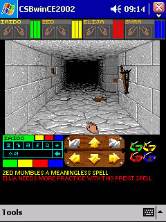
Yeah, it worked in the windows version... i'm guessing that the LO fireball was just bit quiet compared to the fan on my PC or something... I just tried CSB on the ppc which worked a treat and the fireballs there UM, PA & MON fireballs were audible ok!!! I'll retest LO fireballs on monday!!
Also, in trying CSB i opened a windows version saved game which worked fine, I supposed it would... will ppc saves work on the pc?
Posted: Sat Mar 13, 2004 9:58 pm
by Paul Stevens
will ppc saves work on the pc?
They better. It's the same program.
I am starting to debug the tougher cases of the non-aligned
data. When I play my 10-hour ConfluxII movie I get errors
after a couple minutes. The ones I already fixed were the
obvious ones. These new ones are going to be tougher because
the emulator/debugger works fine. Only the real PPC has
the problem.
Posted: Sun Mar 14, 2004 12:13 am
by LazyOldman
Here's for all you guys out there without Pocket PC's, kinda large @ 1.63MB (divx 5) but i couldn't reduce the bitrate anymore without losing what little quality i already got from the webcam.
http://www.appm02.dsl.pipex.com/csbwinc ... -divx5.avi

Posted: Sun Mar 14, 2004 2:36 am
by cowsmanaut
I think this interface makes more sense if it's not to be on it's side..
or something like...
having the movement icons laid out like in the divx file seems akward to me.
moo
Posted: Sun Mar 14, 2004 3:09 am
by cowsmanaut
or.. alternatively (this one is pixel to pixel exact since I based it on Lazyoldman's other screen pic) this is annother layout that might work well also

moo
Posted: Sun Mar 14, 2004 4:17 am
by Paul Stevens
I certainly agree that your last suggestion is much
better than what I proposed. But where is the 'Text Area'?
Your first suggestion is not practical because it does not
contain portions of the existing screen. The attack area
that you show is in two places at different times.
My solution preserves all the pieces except:
*Three pixels on either side of the viewport.
*A shorter Text Area.
What if we use your suggestion except:
*Move the attack area to the far right so as much text
is showing as possible.
*Tap on the text to hide the attack controls.
*Tap on the text again to show the attack controls.
The text is seldom very important in critical situations
and so hiding the attack controls on the rare occasions
that not enough is seen is probably OK.
I can rotate the screen. But I really want to maintain the
'Proper Windows Program' format with the menu and
the title/header. After subtracting them there is not a lot
of advantage in turning it sideways.
Well, anyway, I have a lot of work to do. The screen
format can be discussed for a couple weeks before I
worry about it too much.
Posted: Sun Mar 14, 2004 7:49 am
by cowsmanaut
two more:


moo
Posted: Sun Mar 14, 2004 10:48 am
by beowuuf
I'd keep the movement and attack together at the bottom (movement left, attack right) and have the text box up at the top between the party order and spellcasting window
seems to me hard going to switch between movement and attacks with the mouse the way you have it, whereas you can always argue for spellcasting requiring some effort in a fight : )
Posted: Sun Mar 14, 2004 11:25 am
by LazyOldman
Your original layout actually worked quite well, the movement took some getting used to but it was quite good (for a right hander), i imagine if you're left handed you'd have real trouble with the movement where it was as you'd be covering the screen with your hand when you're reaching over to the movement with the stylus...
Some of cowsmanauts ideas are quite cool. Thinking in landscape? can you make the game go full screen as opposed to a window? i know some ppc games can... but how i don't know?!?! if you can then you'd have the 320x240 so you could use the original configuration... But that would cause problems for left handers too!?!?!?
Or, how about this:

I've cropped the attack buttons, and wedged everything into the bottom area, it'd need some juggling... but i think it'd be better to keep everything at the bottom of the screen below the dungeon, otherwise you have to reach over the dungeon with your hand. I know its sounds like the hand of god here... but from my avi you can see when i reached for the magic, my hand covered the group (bottom right), if the magic/fighting is moved to the top, you'd actually cover 1/2 of the dungeon.
This would probably be best for left & right handers, it would just be a case of whether you could make it look pretty...
Posted: Sun Mar 14, 2004 12:20 pm
by LazyOldman
Ahhh... ok so i see the flaw with my last idea... cropping the attack will probably screw up the attack selection later on... how about this one? i've shrinked the movement arrows to make it all fit...

Posted: Sun Mar 14, 2004 12:51 pm
by cowsmanaut
oh sure.. make me get creative why don't ya!
so here's how it works. You click on the colours below the spell interface to get the weapons actions for the character.. just yet annother idea.. you can ignore the rest.. I started playing with colour coordination of buttons and making the move icons prettier (within the current pallete)
Posted: Sun Mar 14, 2004 2:43 pm
by Paul Stevens
One thing I tried to do was to have the spells and attack
controls visible at the same time. If I understand
correctly, your suggestion would replace the spell
controls with the attack controls when you pressed one
of the color butrtons.
You know what? The positions of all the pieces is in
a table. I can very easily read the table from the
config.txt file so that everyone can have it their own way.
And I can implement a couple of 'Modes' such as your
combined attack/spell control area.
By the way, the redrawn movement controls are not very
likely to get done. Mostly I simply rearrange and show/hide
what is on the Atari screen. I don't redraw anything. I can
add some solid color rectangles (or even some bitmaps, if
pressed). The exception is the portraits where I removed a few
pixels to make them 60 pixels wide. You will see the ugly results
when you die.
I could redraw the movement arrows if you tell me which
pixels should be removed to shrink them.
And another thing.......Any of the pieces can be drawn with
any 16-color palette you choose. You need not be limited to
the original palettes.
Plenty of time to think about these things.
Posted: Sun Mar 14, 2004 3:01 pm
by Toni Y
Posted: Sun Mar 14, 2004 3:06 pm
by LazyOldman
Say there cowsmanaut they are some brigth colours for a Sunday morning!!!
The only problem with having to switch between weapons and spells would be a time thing... it might become tricky when you're backed into a corner with a couple of worms!!!
Paul, does the dialogue for the attack (slash, parry etc) have to come up above the individual character attack buttons? or can it come up anywhere? if it can how about having it show over the end of the text area, as its very unlikely the text will be important just as you have an attack readied...

ed: actually started this before pauls last post... But it'd be nice being able to have a left & right handed version, or possibly a landscape too... is it possible to add another selection screen in (dungeon/utility etc)? it could read a couple of defaults and a custom...
Posted: Sun Mar 14, 2004 5:57 pm
by Paul Stevens
does the dialogue for the attack (slash, parry etc) have to come up above the individual character attack buttons
They are in the same place on the Atari screen. All I do is
copy what is on the Atari screen. What you are asking is that
I examine the Atari screen and if it looks like the 'dialog'
then draw it in a different place. Well, I could, I suppose.
But I don't like it.
Do you understand what I have tried to say? I want to
copy each rectangular piece of the Atari screen to a fixed place.
Perhaps with some SIMPLE editing like removing rows or colums.
And I can rotate the rectangles without too much problem.
And I am willing to make the rotation/translation user-definable
in the config.txt (perhaps for left-handers).
And I can add some small bitmaps.
Your diagram is OK if you simply put both groups together at
the lower space and the 'party order' in the upper space to
fill it in a bit. Then tapping on the text could show/hide the
attack controls.
Posted: Sun Mar 14, 2004 7:01 pm
by LazyOldman
Yeah, i see what you're saying Paul, i wasn't sure just how much control you had over the workings of it... Just along the same lines, simply moving things around, i don't see why it can't work there is plenty of room really...

In this configuration you only lose part of the top line of text, and doesn't the text in DM scroll upwards (new lines at the bottom)? so it would be the oldest line being covered (you could almost, just not show it...).
Just on a side note, when you're modifying the code what exactly are you working with? is it at all comprehensible? I remember when George Gilbert started to write DMute, and he was looking at the Hex to understand what was going on...
Posted: Sun Mar 14, 2004 10:23 pm
by cowsmanaut
yes the point to mine was you click the characters colour on the bottom and you get the action options which incidentaly are the same size as the movement icons .. so it covers the spell and the action buttons entirely (just a simple redraw I would imagine in the code) when you click an action or on pass it pops back to the spells with the action buttons. Now I don't see the problem with covering them up for a second while you are picking an attack.. you wouldn't be using both at the same time. you only have one mouse pointer after all.

I think it makes the most practical use of the space. In addition to that since I do note that it's not the most apealing looking right now.. and adressing the point of using an bmp images with and colours I want..?
I'd be willing to make a little bar that can be drawn there and will keep it looking orderly.
Now any 16 colours? do you mean to tell me there is the ability to use one 16 col pallete for the interface and annother for the rest?
moo
Posted: Sun Mar 14, 2004 10:54 pm
by andyboy_uk
Paul,
Any chance you could PM me a link. I have a PPC and I am actually home at a decent hour tonight (for a sunday
) I would love to try it out for you.
Cheers
A
Posted: Sun Mar 14, 2004 11:43 pm
by Paul Stevens
I don't know what it means to 'PM me a link'.
A link to what? PM? Is that a transitive verb?
The link to the Pocket PC executable has been announced several
times.
dianneandpaul.net/CSBwin
CSBwinCE13Mar.rar.
It just barely works a little bit. And most of that is just
by luck, I am finding out slowly.
Sorry I am so dense.
Posted: Sun Mar 14, 2004 11:51 pm
by Paul Stevens
ability to use one 16 col pallete for the interface and annother for the rest?
The Atari screen is drawn with 16 colors. They are numbered
0 through 15. Currently there are two palettes. The part of
the screen containing the viewport and all the rest of the
screen on the same scan lines uses one palette. The parts
above and below the viewport use a second palette.
My code cannot change what is on the Atari screen. But
it can copy rectangular regions to the Pocket PC screen.
In the original CSBwin there were four regions. My Pocket PC
version can have as many regions as we wish.
Each rectangular region can have its own palette. So that
the 'Move Forward' might be copied by itself and be red.
The 'Move Backward' could be yellow. The spell controls
could be white.
Posted: Mon Mar 15, 2004 1:10 am
by beowuuf
PM = personal message. I'm sure the Oxford English Dictionary will let it in next edition.
And if by dense you mean packed with knowledge and skill, then damn right you should apologise! You are making the rest of us look bad with your good work!
Posted: Mon Mar 15, 2004 1:45 am
by sucinum
beowuuf wrote:You are making the rest of us look bad with your good work!
...and happy with csb4win (soon for ppc

)

Posted: Mon Mar 15, 2004 2:38 am
by cowsmanaut
hmmm interesting.. would you let me get away with this then?
*rubs hands eagerly*
moo
Posted: Mon Mar 15, 2004 2:51 am
by copperman
Ooo that's nice, can we have that for RTC ? Please

Posted: Mon Mar 15, 2004 3:34 am
by Paul Stevens
hmmm interesting.. would you let me get away with this then?
On close examination it appears that you changed more than
the palette. So the answer is 'No'.