Page 1 of 2
traditional? or new?
Posted: Wed Dec 24, 2008 9:52 am
by cowsmanaut
should I go for the traditional and faitfull look? or should I go further and try for something more/ newer?
Posted: Wed Dec 24, 2008 10:00 am
by Ameena
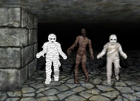
Looking at those Mummies in that setting, I have the following opinions...
The first one - Looks kinda cute, actually, probably because of his smily-looking face beside those other two. The hard edges don't quite go with the scenery though. Aaawww, poor original DM Mummy

.
The second one - Looks like something out of something else I've played, but can't remember what. Hrmm, looks more realistic, but I dunno if it quite, sort of...fits...somehow.
The third one - Like an original DM Mummy but who's been smoothed over and given a face like one of the Scarecrows in the "Human Nature/Family of Blood" two-parter from the third recent series of Doctor Who. I think I like this one the best 'cause it's the one I think fits best with the surrounding walls, maybe because the walls also look like DM walls that have just been "updated" in their look

.
Posted: Wed Dec 24, 2008 10:07 am
by ian_scho
Can you go for the look that keeps you most interested in the project?!
I still love those DMJava walls, Cows. Like the original wall set I dont tire of them. I promise I'll publish my unfinished work someday (testing, testing, testing, ...).
Posted: Wed Dec 24, 2008 10:10 am
by linflas
i vote 2.
Posted: Wed Dec 24, 2008 10:28 am
by MasterWuuf
Anything but #3. He should be given the name Vagueman.

Posted: Wed Dec 24, 2008 10:30 am
by MasterWuuf
I think I'd opt for #2, in spite of the fact that I like #1 (DM prejudice?).
#1's right hand looks like it's showing an allergic reaction to one of those giant bees in DM.
(Yeah, I know that 'thumb-looking' thing is a loose piece of fabric)
Posted: Wed Dec 24, 2008 11:46 am
by Trantor
As much as I love the original DM mummy, I'd say that the one in the middle fits the wallset best. The right one doesn't really look convincing to me - too close to the original to be seen in its own light, and so far away that you think "Hm, I liked the DM original one better".
Posted: Wed Dec 24, 2008 11:52 am
by cowsmanaut
just to be clear, I don't expect anyone to pick #1 since I wouldn't have to do anything.. #2 is what I started working with, it's actually my concept drawing for the 3D one I've begun, but then I stopped to try and make #3 because I thought it might work to just clean up the original.
so two votes for new mummy, and 1 vote for the revisited traditional mummy
Ian, I don't know that I can assure that I will complete all of the dungeon graphics, but I did that entire wall set and now I'm working on monsters.. the fact that people state they would like to use them is great, however I've yet to see a completed dungeon with them..
Posted: Wed Dec 24, 2008 12:42 pm
by cowsmanaut
or
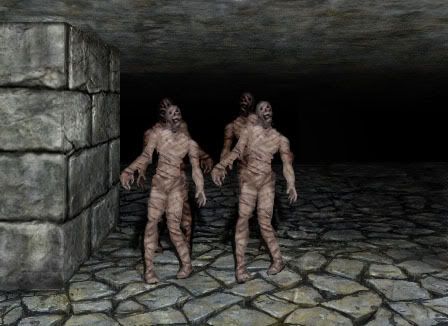
thought it might be easier to choose if you could see them as a unit of their own kinds.. I find having two bright white ones and a darker one makes the darker seem a little of an outside.. This way you can see them as they would exist.
I also brightened the new mummy.. just because he was a bit dark
Posted: Wed Dec 24, 2008 12:44 pm
by beowuuf
Vote for number 2, it is just much more interesting and fits to the loook, the third one looks exactly like you are trying to stay faithful to ther old mummy, and it looks a little silly with some more realism
Posted: Wed Dec 24, 2008 1:47 pm
by cowsmanaut
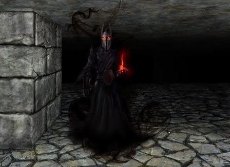
in my travels over the net I saw a drawing which inspired me to try and do chaos with a meaner look.. gauntlets etc.. and curling smoke, so I sat down using a similar pose and went to it.. and here we are.. a concept for Chaos.. I'll be doing a more detailed one.. but this is the concept..
Posted: Wed Dec 24, 2008 2:02 pm
by Trantor
Wow, that's amazing!

Looks absolutely fantastic!
Oh, and go with the new mummies, they look even better now that they are a bit brighter.
Posted: Wed Dec 24, 2008 2:17 pm
by Lunever
Depends on what you intend to do.
Mummy #2 (the middle one) looks more like a BG2 mummy imho. Good choice for some new classical fantasy adventure.
But if you want to remake the classical DM1 with new grafix (which would be extremely cool with that high qualitiy), I'd rather go for mummy #3 (the right one).
And LC looks absolutly great!
Posted: Wed Dec 24, 2008 2:33 pm
by beowuuf
LC looks absolutely fantastic!
Posted: Wed Dec 24, 2008 7:03 pm
by MasterWuuf
cowsmanaut wrote:in my travels over the net I saw a drawing which inspired me to try and do chaos with a meaner look.. gauntlets etc.. and curling smoke, so I sat down using a similar pose and went to it.. and here we are.. a concept for Chaos.. I'll be doing a more detailed one.. but this is the concept..
Now this guy would 'put the scare' into you, if you saw him the first time, oh, about 2:00 am.

The #2 mummies look fresh, plus they do seem to match the background better (darker and more foreboding).
Posted: Wed Dec 24, 2008 7:11 pm
by MasterWuuf
Time to share: I looked at those four, with the back two in opposite stance,
and I kept thinking, "Hmm. If you could get 'My Wild Irish Rose' as background music,
it would sure destroy that foreboding look."
Talk about ruining their debut!:o
P.S. My Wild Irish Rose is barbershop quartet style.
Posted: Wed Dec 24, 2008 8:18 pm
by cowsmanaut
well you can't have traditional mummies with a newly designed Lord Chaos

if it goes with the traditional Mummies, I'll do a tradition chaos too.
However you can say that you would like to see "X" adjustment to the new mummies if you want to keep Lord Chaos and yet don't quite like the new mummies

Posted: Wed Dec 24, 2008 8:29 pm
by Lunever
Dunno, even if you just presented me the new LC outside any DM context, I'd still instantly recognize him to be LC.
While mummy #2 looks very cool I wouldn't spefically tie it to DM.
Mummy #3 I would instantly connect to DM.
As I said, depends what you're up to, a completely new dungeon, or the ultimate DM remake.
Posted: Wed Dec 24, 2008 9:21 pm
by Ameena
Woah, I thought "Holy crap!" when I saw that LC - he looks very cool

. And I'm less sure about the Mummies now...I'm not sure which one I like best now, lol.
Posted: Wed Dec 24, 2008 11:30 pm
by cowsmanaut
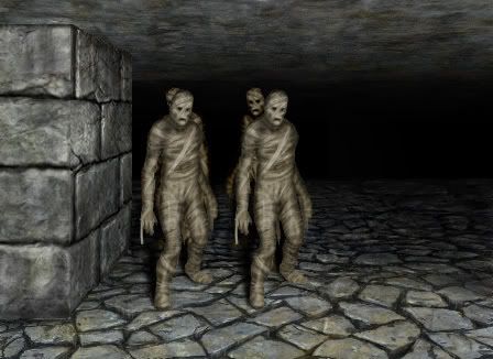
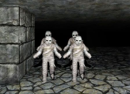
something more inbetween then?
Posted: Wed Dec 24, 2008 11:52 pm
by Ameena
Hrmm, they look okay. Faces still remind me of the Scarecrows (though a bit less than before)
.
Posted: Thu Dec 25, 2008 1:15 am
by Joramun
Ameena wrote:Woah, I thought "Holy crap!"
Yeah ! Those mummies do wipe your ass !
(It means they rock)
I also like Chaos.
A more "serious themed" dungeon would be welcomed, btw.
Posted: Thu Dec 25, 2008 1:46 am
by MasterWuuf
I was kidding about the barbershop quartet effect.
Still, I'm glad I mentioned it.
I think the tilting forward of their heads was a definite positive.
Posted: Thu Dec 25, 2008 1:59 am
by cowsmanaut
joramun , it's cloth a special mummy cloth.. not bum wipe
Posted: Thu Dec 25, 2008 2:50 am
by Lunever
Well, if you have a rhythmical change between them 2 last mummy pictures you can make them do the DM verison of that zombie dance-contest of the Bard's Tale story by Ubisoft.
Like on
http://de.youtube.com/watch?v=GgX754OFAKI
although the vid is bad qualitiy.
Posted: Thu Dec 25, 2008 8:12 am
by MasterWuuf
I played the original Bard's Tale, I believe on the PC (surely not the Atari?).
The video confused me, until I remembered getting the 'new and improved' Bard's Tale (PS2), and called in my oldest son to ask if he remembered that dance scene.
He did. He thought it was an odd part in the game.
Posted: Thu Dec 25, 2008 3:57 pm
by beowuuf
Hmm, I like both of the two designs - and think that if you do both instances in the dungeon, with exactly the same stats, that it would make them look visually more interesting en masse.
Either that, or save the more Dm looking mummy (the new one) as some form of tougher boss, as it looks more determined and less in torment
Basically, why choose when you can have both!
Posted: Thu Dec 25, 2008 10:25 pm
by linflas
cowsmanaut wrote:
brightness is good but i would add more contrast.
as beo said, you should mix the 2 mummies postures in a same group !
oh... and Chaos is perfect.
Posted: Fri Jan 02, 2009 9:34 pm
by Gambit37
cowsmanaut wrote:
something more inbetween then?
I prefer these ones the best. Nice and spooky but still have a DM 'feel' to them.
One note about overall brightness: while this level is great for spooky images, it does mean that as the dungeon gets darker, it'll be darker than the equivalent original game, making it slightly harder: torches won't be as bright and magic won't make it as bright either. You might want to up the overall brightness of the dungeon and creatures if you want to match the difficulty level of the original game.
Also, the viewport is too big. It needs to be 448x272 for DSB/RTC. Is this for DM Java?
Posted: Fri Jan 02, 2009 10:08 pm
by MasterWuuf
That last pic reminds me of "The Thriller" with Michael Jackson.
(hope that doesn't spoil it for anyone else)