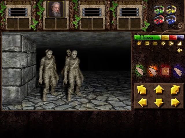
I would like to comment on the initial post
cows wrote:Not sure if I'm fully happy with the colour coding, for me it feels a little out of place, but it does help you identify them quickly.. I'd appreciate some thoughts.
The colours are garish, like in the original. Here, they pop out rather much-then again, as you said this is not as bad as it may seem because it helps identify ..
the thing is twofold:
first help identify - clear purpose and less is more here.
I am not completey sure as where to go there.. looked at interfaces from landsoflore, evils doom, chaosstrikesback, worldofwarcraft(crazy) and wizardry 6&7; some jrpgs too.
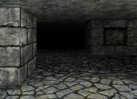
it seems the interface is laid on some background / stone or pillar etc images, surrounding the viewport. Imo this has to be very subtle. maybe going all black(without bg) is too less and does look off as well
In dm, the attack section and rune section is monochrome. THis helps in setting this portion apart from other elements on the screen.
In the initial inventory - picture, this is a little too prominent. Its all colours that do not read with the background or distract .
The borders of the champion sections, with the plant´s leaves seems too broad. I would go for something less border width-ish and increase champion pics
(show what is important, border at those places is not. Probably better to place this plant border around the viewport or something...)
-->I would re do/ re-arrange the champion section, but I am not sure how exactly.
there is try and error but then it could help to have an underlying grid system.
Aligning everything according to it, helps getting a tidy look-I should do that with the original dm-interface(also maybe dm2/2weapon handling)
and identify the underlying grid there. It helps also to see what is the smallest unit(probalby the rune) All other elements could build up from this smallest unit.
THe portrait -while looking really very good in itself! - i would throughout dungeon master prefer something less antique/realistic but more fresh, hip and youthful looking.

But maybe that is just me.
The haircut and beard is from another century(19th) and he looks all too grumpli unhappy
probably would not choose this fella. Btw, NAbi is afro - american
(here you can see that dealing with the dm-champions is not easy to satisfy. Too much connection to all champions have constituted a firm foundation on the looks, at least for me )
I have changed a bit of the interface from cows
and here is the result/
just a quick mock up, and have tried to pack things more tightly together:
http://img718.imageshack.us/img718/2676 ... face4a.jpg


